How to make a navigation bar that increases your conversion rate
The navigation menu is one of the most important factors on your website, both in terms of accessibility of the content of the site and generating conversions.
What are the advantages of having a good navigation menu?
- Differentiation
- Content accessibility
- Good UX encourages people to come back
- Generate more conversions for your business
When designing your navigation bar, analyse your competition but do not copy it, one way to differentiate yourself is based on how you show the content to your users, so try what gives better results while also making it unique to your brand.
It does not matter how your navigation is designed, however there are certain guidelines that are proven to work better in most cases.
Burger menu
Since mobile traffic exceeds desktop traffic by over 60% and, in some cases, desktop traffic is minimal, it is essential to make the browsing experience as smooth as possible on a mobile device.
The hamburger menu are the 3 lines that are displayed in the mobile version of your website, this mode of use arose with the rise of smartphones and has been necessary to make the content accessible on a reduced screen.
The problem starts when one seeks to transfer this form of use to the desktop version, which in many cases is unnecessary.
The reason for using a hidden menu is a mobile phone is because of the reduced screen size, so you have to take care that what is shown is the most relevant, unlike a pc or laptop screen where the space is several times larger, so hiding the content in a menu adds an extra click, making your UX worse.
Due to this we recommend you only use the hamburger menu in the mobile version and full links in the desktop version.
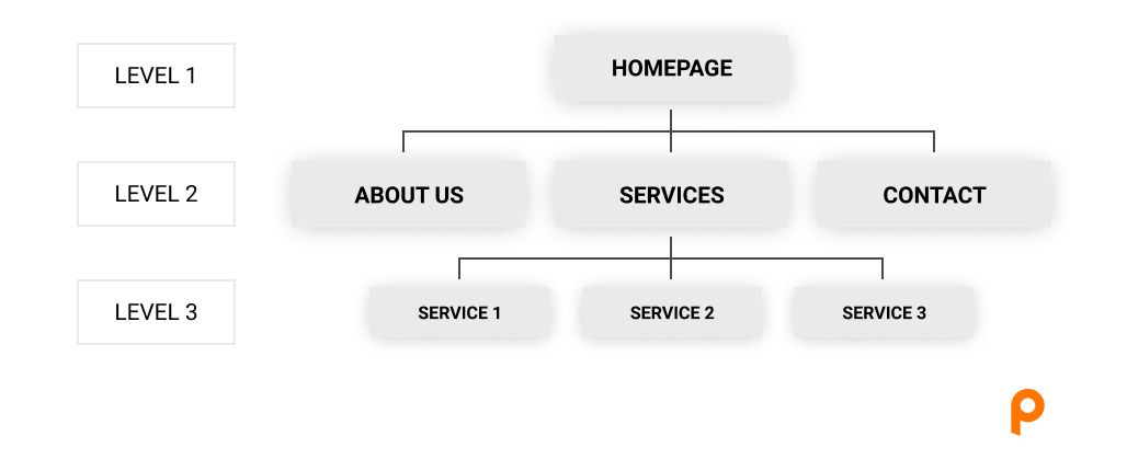
The 3 levels of depth
A good practice to define the flow of your navigation menu is to make the user find your content in no more than 3 clicks.
There are cases when this rule does not apply, e-Commerce being one of those due to processes that involve a cart, because you have to add a cart, checkout, confirmation page…
Here’s an illustrated example of the 3 levels of depth by us:
Highlight what’s important
A new user lands on your website, what do they look for and how can you make that information easy to find?
What is most important to you and the site visitor should be highlighted in the navigation bar. In order to determine this, you will need to know what the purpose of your website is, as well as what information your target audience wants to know.
Once you know that, you should highlight one or two links. The most common way to do this is by converting them to buttons instead of links, directing the user focus there.
Limit the number of links
This one is self-explanatory.
For larger sites, limiting the number of links in the navigation bar is a smart move. As a result, the focus is narrowed and the site visitor is directed precisely where you want them to go.
Make Site Search Frictionless
Those who run a site search convert roughly twice as often as those who don’t.
It makes sense: visitors who use search typically are looking to make a purchase or to take action. Plus, the chances of finding what they seek are greatly increased.
E-Commerce are usually sites that rely heavily on search to help their customers. You can often see their navigation bars are optimized for that, leaving only a shopping cart, burger menu and the search bar on their mobile version.
To summarize, the more user-friendly your navigation experience is, the more time users will spend on your site.
At Polax, we’re experienced in optimizing web navigation menus and websites. If you’re interested in testing and improving on your website, feel free to contact us.